11 Ways to Design Better Slides for Virtual Presentations

Creating clean and aesthetically pleasing slides should be your mantra when designing for any presentation. But the slides that work for in-person presentations don’t always work best in the virtual world.
With more presentations going remote and online, it’s important to consider how your presentation slides might be seen on a laptop or desktop screen, as well as a mobile device. Something that might seem fairly uncluttered for a large projection screen or even a laptop may not read as well on a screen that may only measures 5 inches high and wide (or less).
And it is not an unimportant consideration. Over the past decade, Americans who say they own a smartphone has increased to 81 percent from 35 percent. Further, nearly 40 percent of U.S. adults use a smartphone to access the internet – up by nearly double just six years ago. Today, one-in-five American adults say they own a smartphone but do not have traditional home broadband service, according to Pew Research Center.
When designing for smaller screens, such as those on phones and tablets, it’s best to be guided by scale and readability. Here are 11 tips to make your virtual presentation slides stand out:
11 Ways to Better Virtual Presentation Slide Design
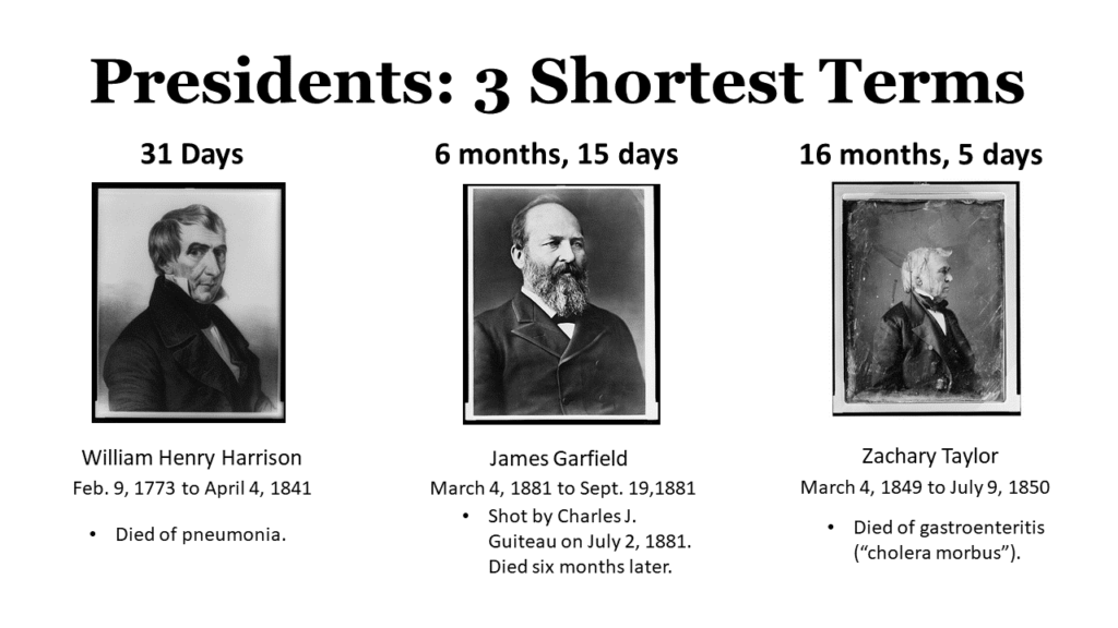
1. Increase the slide count
Multiple photos and lines of text might work well enough on a slide that is being seen in a conference room, or even a large desktop monitor. When viewed on a smartphone, not so much.
It’s always been a good rule of thumb to stick to one point or idea per slide. When scaling for a smaller screen, that design concept is even more imperative. You may need to stretch an idea over multiple presentation slides to ensure you are not forcing your audience to struggle to read the fine print or make out your image.
Here’s an example:
Here’s how it looks on a mobile:
Here’s are the revised slides for smaller-screen viewing:


2. Vary the visuals
Simply increasing your slide count is just part of the story. Your slides also need to be distinct and interesting. As a vocal monotone might put your audience to sleep, a visual monotone of similarly designed slides will have the same effect. Your slides provide the visual interest that helps to break the pattern so you can regain and retain audience attention – which is even more imperative during a virtual presentation when you are competing against multiple multitasking distractions. Try for a mix of slides – vary text, images, illustrations, quotes, and easy-to-read graphs and charts.
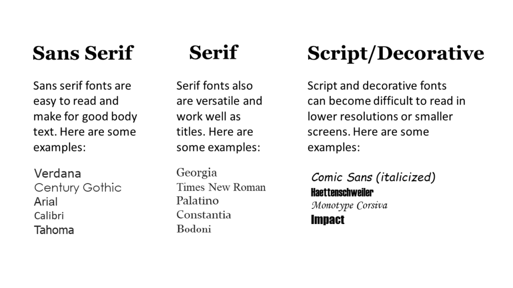
3. Pick the right font
Readability, particularly on smaller screens, is made easier by the font you choose. Try to avoid fussy or decorative fonts whether using PowerPoint or another slide presentation software. (On older mobile devices, the fonts may not show up as you intended – and default to less ornate font styles.) Serif and sans serif tend to work better across a range of resolutions and screen sizes. Even within those broad categories, some fonts look good on a large screen but fail to scale properly for a mobile device (which is why it is always good to test your presentation on multiple devices). For instance, if the lettering is too delicate, it may be harder to read on a small screen. The Purdue University Online Writing Lab (OWL) has some good examples of serif and sans serif fonts.
Also, keep to only one or two fonts to avoid a typographical fun house with too many designs and shapes. You don’t want your audience to become distracted by the design and fail to remember your main points and key concepts.
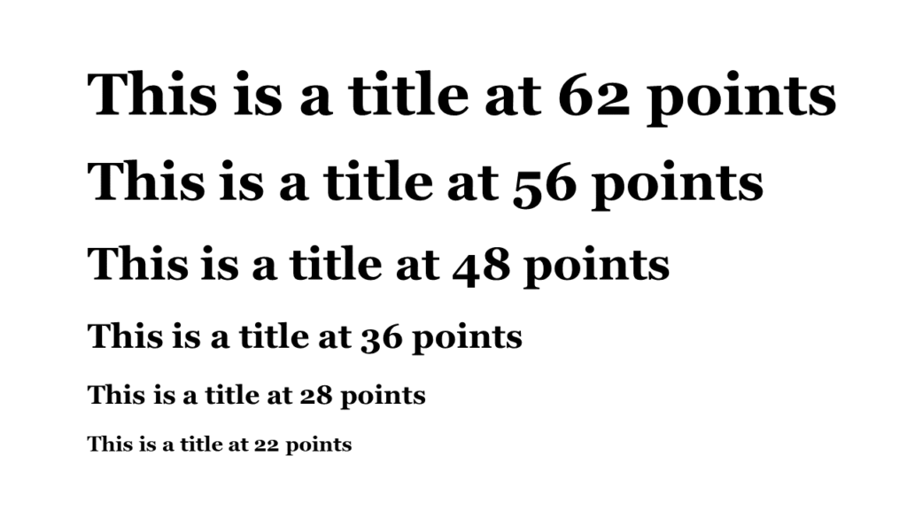
4. Go big on text size
For in-person presentations, it’s suggested to keep the font size large enough so that a person in the back of the room doesn’t struggle to see. For a virtual presentation slide, you may get away with a somewhat smaller font for a laptop or desktop monitor, but don’t go too small for mobile.
Keep titles to a minimum of 36 (see examples below). The size of your text – along with graphic emphasis, such as bold letters – can help your audience to better understand the information that is the most and least important. Titles convey overarching ideas, while the body text provides the details – the text size should be adjusted accordingly.
Test out your virtual presentation slides on the smallest possible screen to see if you need to bump it up. Also, check the titles on a smaller device before you go “live” to make sure the screen doesn’t compress the width, forcing words onto the next line and causing an overlap.
Here’s how it looks on a mobile:
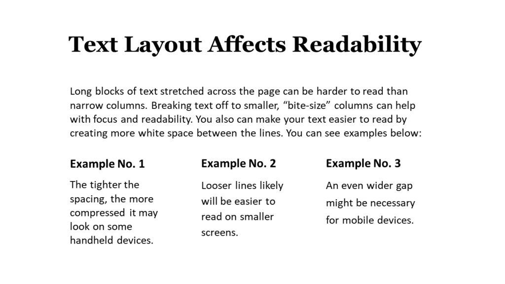
5. Let your words breathe
Avoid running large blocks of text across the slide, which are harder to read (in-person and in the virtual world), and make sure there is enough white space between your lines of text. In typographical design, they call that leading. You also want to avoid going to the edges of the slides, since display settings may differ among mobile devices. Finally, strive to be concise. If you say more with less, you will inevitably increase the white space.
 6. Line it up
 6. Line it up
Try to avoid mixing multiple text alignments. Left-aligned text for titles, subheads, and labels tends to look cleaner. Also, if your presentation is seen on multiple screen sizes, centered text might not appear as you intended, possibly appearing off-center.
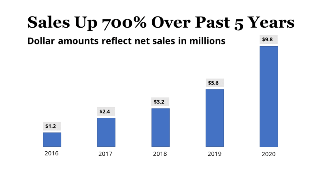
7. Assess your need for charts and graphs
Smaller screens are not likely to be a great canvas for charts or tables with copious amounts of data. (Few screens – small or otherwise – benefit from a chart with data that is not immediately clear to comprehend.) If you decide to include charts and graphs, consider whether you can winnow down the information to a cleaner graphic. You can always send more data-dense handouts to your presentation audience through email – or offer a link where they can get the background material.
Here’s an example of a slide for an in-person presentation:
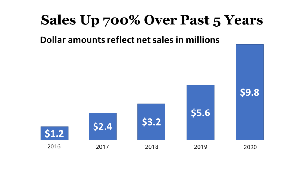
Here’s how it looks on a small mobile device:
Here’s how you can adapt it for a small mobile device. Text size has been bumped up and some other changes make it easier to read:
8. Avoid a Rainbow
Color is an effective tool to highlight and emphasize your most important points or key concepts. If your color palette is consistent, it helps your audience to quickly assess data across your slides. For instance, you can make all your titles one color and your body text another. Or, you can highlight key words or points with a consistent color throughout your slides. If you decide to incorporate some simple bar charts, you do not need to include a legend for each if the colors of the categories remain the same (i.e., deep purple equals sales from 2020 and orange is projected sales for 2021).
9. Employ contrast in your design
You also can effectively use color contrast to make data pop off the screen or signal a shift to a new topic or point (as can be seen in the example below). Just remember that some pairings are hard on the eyes. For instance, green on red would be a struggle for someone who is color blind. There are several online resources to help you avoid that pitfall, including Adobe Color, Vischeck, and Check My Colours.
Some additional tips:
- Make sure there is enough of a contrast between colors. Color settings or resolution on another device might be different from yours or more easily wash out. So, make sure there is enough of a distinct difference, rather than subtle variations.
- Test your slides in a well-lit and dimly lit room to determine if the lighting might require you to tinker with the design.

10. Incorporate effective images
Given the social photo sharing app Instagram has more than 1 billion monthly active users, it’s clear we like our pictures. So, find some images, such as photos or illustrations, that can reinforce your points, whether literally or more conceptually. Finding an effective image for your PowerPoint presentation takes time, but a compelling image (such as the one below) can do more to reinforce your key point than words can do alone.

11. Keep it simple
Depending on the internet connection, animations, transitions, and videos could cause problems. This particularly becomes a challenge if someone is accessing your presentation on a mobile device and using a network with unreliable or spotty connections. This could cause a case of digital hiccups that will be as annoying as their natural counterparts.
Share this article
- Share on Facebook
- Share on Twitter
- Share on LinkedIn
- Share on Email
-