Public Speaking Report 8: 5 Ways To Design Better Data Slides

You’re in a data-heavy industry or speaking to an audience that values data. But that doesn’t resign you to using slide after slide of dense, hard-to-read charts.
When you pick the right visual, clear the clutter, drop the nonessential information, and use proven design principles, you can reduce the cognitive load on your audience and help them more quickly interpret your data.
Your scientific findings, your company’s financials, or in-depth statistical analyses become more dynamic and memorable when your audience can better see the story your data tells.
In this report, we offer you five tips on how to better do that.
5 Ways to Better Display Complex Data
You know the message you want your audience to remember, and the data that will help you to share it. Now, you need the best way to show that.
1. Determine What You Want to Show
Data is just data until you give it context and meaning. Do you want to show …
- A relationship between two or multiple data sets? (When gas prices go up, revenue drops.)
- Trend over time? (The average global temperature has risen over the past 20 years.)
- Comparison? (The return on investment was higher this year than last.)
- Distribution? A pattern? (The volume of shares that are traded at a specific price.)
- Individual parts that make up the whole? (Total sales broken down by each product you sell.)
Once you know the “story” of your data, you can pick the best visual aid to say it.
2. Select the Proper Visual
The visuals you choose can help your audience more quickly interpret the data.
One way you can do that is to employ what Andrew Abela, author of Advanced Presentations by Design, calls the “squint test.” If your audience were to squint, so the text became blurry, could they understand the point of your data? The design or layout of some graphs better convey comparison, for instance, while others better highlight how parts fit into the whole. The right layout will give a better sense of your data “story.”
As Cole Nussbaumer Knaflic notes in her book, Storytelling With Data: A Data Visualization Guide for Business Professionals:
“If you’re wondering ‘What is the right graph for my situation,’ the answer is always the same: whatever will be easiest for your audience to read.”
In this report, we focus on the more commonly used graphs for technical, scientific, and academic data, as well as tips on how best to use them.
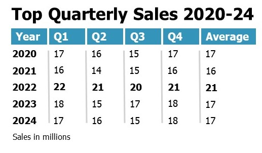
Table
In general, tables are not the most effective of visual aids, as they are more difficult to visually interpret. They don’t provide the visual cues that other visuals do, such as differing bar lengths, a rising (or falling) trend line, or a curve that shows distribution. Still, you may need to or be required to use one.
When to Use Tables:
- To present exact numerical data of two or more variables
- To show comparisons, trends, relationships
Best Practices:
Drop heavy borders. Either lighten them or create minimal ones. (See table below.)
Eliminate data. Do not include material that doesn’t support the key point of your slide.
Round off numbers. All those decimals could become distracting.
Size it right. It should be large enough to see in the cheap seats.
Provide emphasis. Use bold font on column or row headers, or particular numbers, to provide relevance and establish data hierarchy.
Here’s an example:
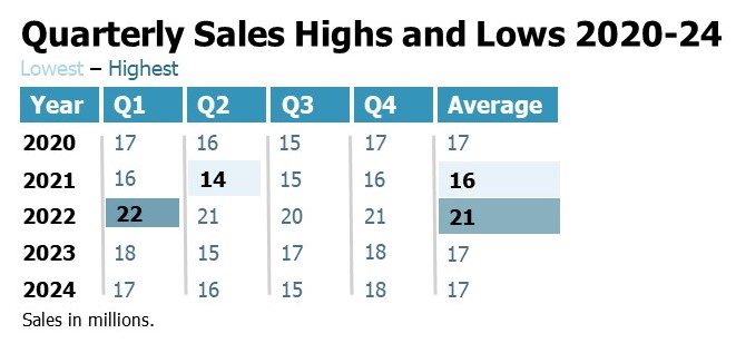
Heatmap Table
This version of a table color codes certain cells of important data points. (There are more sophisticated heatmaps where cells are of varying color or saturation to show relationships, comparisons, or patterns within your data or changes over time.)
Best Practices (in addition to those for tables):
In addition to those listed for tables:
- Emphasize with color. Choose one color and adjust the value to highlight cells significant to the point you are making. Perhaps you pick blue. A darker blue might indicate the highest value, while a lighter blue indicates the lowest. Also, make sure text contrasts well with background color and is not challenging for those who are color blind. (See table below.)
Here’s an example:
Line Graph
One of the more common graphs, the line graph analyzes continuous data (one or multiple categories) over time. For instance, you could track a range of temperatures over several days or show the fluctuation of a product’s price (or two products’ prices) over 10 years.
When to Use a Line Graph:
- To track trends over time with single, double, or multiple series of continuous data (Bar graphs do this too, but it is easier to see the trend in a line graph.)
- To plot out individual points
- To compare data
- To show distribution patterns
Best Practices:
Time it right. Time intervals should run from left to right. The baseline (horizontal line) must reflect equal and consistent intervals. For instance, don’t mix months and years.
Clearly label axes. Avoid vertical or diagonal labels, as they can be harder to read. Consider labeling your line (lines) directly on the chart, rather than providing a legend.
Remove the border and grid lines. If you keep grid lines, lighten them to fade into the background.
Limit the lines. Keep to no more than four lines for each chart. Otherwise, you have a spaghetti graph that often is hard to read and interpret. Use a different color for each line. (As with other times that you use color, ensure that the combination you choose will work for people with partial or total color blindness.)
Baseline basics. The baseline doesn’t have to begin at zero (which is a best practice for bar graphs). Perhaps you are starting at a certain date, such as the day of the first known case of a pandemic illness or the first day you started recording a stock price.
Similar Graphs
- Area charts. These also are used to show how data changes over time. However, instead of a single line, the space between the line and baseline is filled with color. They may better show how parts of a whole compare – such as the annual revenue from two different departments.
- Timelines
Here’s an example of a line graph:
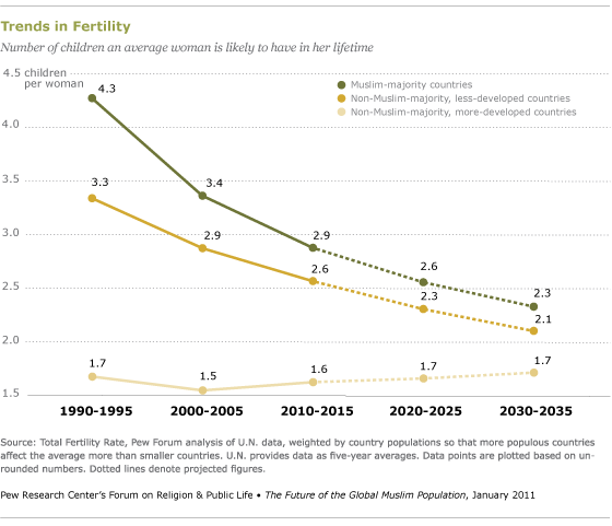
Source: Pew Research Center
Bar graph
A bar graph uses horizontal or vertical bars (also known as a column graph) to compare data among categories over time or some other measure. For instance, you might want to reveal survey results among certain age groups, or you want to show a stock’s open, high, low, and close prices over a stretch of time.
When to Use a Bar Graph:
- To track trends over time with single, double, or multiple series of continuous data
- To compare data
- To show distribution (parts of a whole)
There are two types: horizontal and vertical.
Horizontal
When Best to Use Them (vs. Vertical):
- When you have lots of bars to plot. (Still, refrain from too many to avoid cognitive overload. Consider breaking up the results into multiple slides.)
- When your category labels are long.
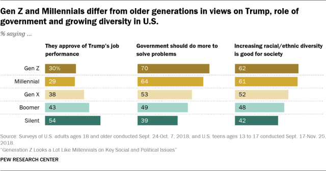
Source: Pew Research Center
Vertical
When Best to Use Them (vs. Horizontal):
- When you only have a few categories.
- When you want to show negative and positive values. (You can do it horizontally, too, but we tend to read it better vertically.)
- When you are comparing a change of some data set over time. (It’s easier for us to asses that if presented from left to right rather than from top to bottom, or bottom to top.)
Here’s an example:
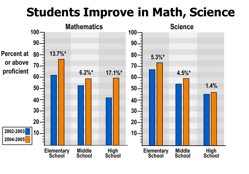
Student achievement at 123 schools participating in the National Science Foundation’s Math and Science Partnership program. Source: Nicolle Rager, National Science Foundation
Best Practices:
Many of the best practices for tables and line graphs apply here too, such as removing unnecessary information and eliminating borders and grid lines or minimizing them. Here are some additional tips:
Avoid the rainbow. Too many colors across too many bars make it difficult to quickly interpret the data. If you are using multiple bars, pick colors that work well together (such as the survey results above). You also can highlight just one bar (the top percentage response) and fade the rest to the background.
Stack your bars with intention. With years or ages, it would be natural to keep the order numerical. But in the case of survey results, for instance, perhaps you want your bars to go from the highest percentage down to the lowest (or vice versa) or by the groups of respondents. It depends on what story you are telling with your data. A consistent order gives your audience a way to quickly frame and interpret the results each time you switch a slide.
Proper spacing. The white space between your single bars or groups of bars shouldn’t be too narrow or too wide. Half the bar width in between typically works best.
Baseline starts at zero. Otherwise, the data can be skewed. That said, you could remove axis labels or eliminate an axis if the results are just as clear by directly labeling the bars and including a highly descriptive slide title.
Similar Graphs
- Stacked vertical and horizontal bar charts – They reveal parts of the whole and allow your audience to compare totals across categories. But, they are not always as easy and quick to interpret.
Population, discharges, and days of care, by age: United States, 2000 and 2010
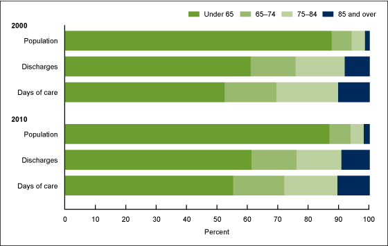
CDC graph based on population, discharges, and days of care, by age in the United States, 2000 and 2010. Source: CDC/National Center for Health Statistics, National Hospital Discharge Survey, 2000–2010.
Waterfall Chart
A waterfall chart shows parts of a whole or tracks one piece of data and show how decreases and increases lead to the final value. Nussbaumer Knaflic does an excellent job of detailing this graph on her blog.
When to Use a Waterfall Chart:
- To show change over time
- To compare product earnings
- To analyze operating costs
- To evaluate profit
Best Practices:
Color cues. If your chart reflects negative and positive values, make sure to use a different (but consistent) color for each type of column.
Be mindful of orientation. Typically, the starting point and end point (or initial and final value) start on the horizontal axis, and the intermediate columns “float.”
Here’s an example:
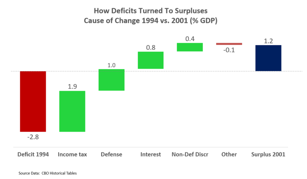
Credit: Farcaster, Wikimedia Commons. Licensed under CC BY-SA 4.0
Scatter Plot
Scatter plots are like line graphs, but they are better at showing different types of relationships between two variables. You might want to see how carbon dioxide levels relate to temperatures or how a property’s square footage relates to sale price.
When Best to Use a Scatter Plot:
- To show patterns in large sets of data.
- To identify relationships between two variables.
- To show distribution.
- To reveal outliers.
Best practices:
Make your point. If you want to talk about the average, you could make that point larger, give it a dominant color, and label it. Or, say you want to highlight the relationship between gross domestic product per capita and life expectancy in countries around the world. You’ll have a lot of dots. If you want to just focus on the top five, highlight those and fade the rest to gray. Labeling the dots will provide further focus.
Label within the graph. If it makes sense for the data, you could highlight correlations with concise subheads near any clusters. But the small text in the example below is better in a handout than in a projected slide.
Here’s an example:
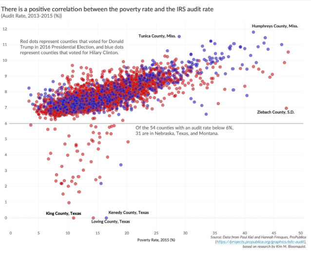
Screenshot of scatter plot from data visualization specialist Jonathan Schwabish’s blog policyviz.com
Histogram
A histogram may look like a bar chart, but it’s not. A histogram tracks how many times a certain thing occurs within a specific range; such as the number of sales each month for a year or annual stock price returns.
When Best to Use a Histogram:
- To track frequency distribution of a continuous numeric variable, called a bin or class. In his blog, data visualization specialist Jonathan Schwabish offers a comprehensive look at this type of graph.
Best Practices:
Keep it tight. There are no gaps between the bars.
Don’t skew results. Use a zero-valued baseline.
Be consistent. Ranges should be equal in size.(For instance, if it is dollar figures, $0 to $9, $10 to $19, etc.)
Here’s an example:
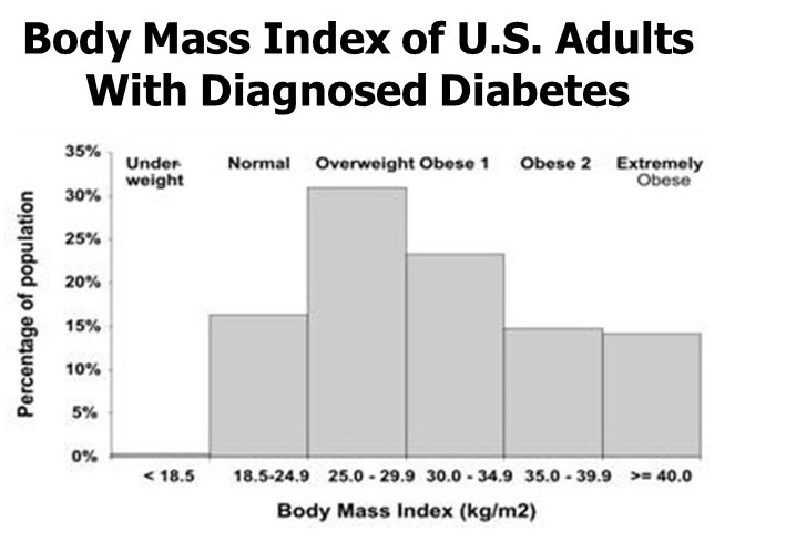
Distribution of body mass index among U.S. adults with diagnosed diabetes, 1999–2002. Source: CDC
3. Create visual order
If your design is cluttered, filled with unnecessary information, and delivered without a sense of order or importance, you risk quickly losing the attention of your audience. Distracted, overwhelmed, and unsure of where to look, they may simply decide it takes too much brain power to interpret your visual.
By focusing on several additional elements, you can simplify, organize, and structure your slides to help your audience better understand your data.
Title (or Headline) of Your Chart
Create a title for each graph slide that accurately and concisely reflects the key takeaway of that visual. Don’t be vague. If your chart is about a trend in global temperatures, then “Last 5 Years Were the Hottest on Record” is a better title than “Global Temperatures on the Rise.”
Hierarchy of Data
Text size and font style provide quick visual cues as to the priority of your data.
Best Practices:
Size matters. As a general rule, make your titles a minimum of 36 points.
Avoid fussy fonts. Serif and sans serif work best. Steer clear of decorative fonts.
Emphasize. Bold can provide emphasis on subheads or important points. But be spare with textual effects: bold, underline, or italics. If everything has emphasis, the audience will likely be confused as to where to look.
Alignment
Try to avoid mixing multiple text alignments. Left-aligned text for titles, subheads, and labels tends to look cleaner.
Labels, Axes, and Legends
Consider eliminating the axis and labeling the data points directly, which can be particularly effective for line and bar charts.
You also could consider removing a legend if the labeling makes its existence redundant.

Photo by Maureen Sgro on Unsplash
4. Use Color Wisely
As already noted, color is an effective tool to highlight and emphasize your most important points or key patterns.
If your color palette is consistent, it helps your audience to more quickly assess the data across multiple charts and slides. For instance, if you are sharing data findings across multiple bar charts, you do not need to include a legend for each if the colors of the categories (bars) remain consistent. Data presentation expert Stephanie Evergreen covers this concept nicely on her blog.
Choosing Your Palette
Ideally, you pick three to four colors (in addition to using black, white, and gray), to use for text and graphic elements – including one that can be used as a highlight color. You can find professionally curated color schemes in the PowerPoint “themes” feature, as well as other online resources.
Contrast
While contrasting colors add emphasis, some pairings are hard on the eyes. Red letters on a blue background, for instance, can cause visual headaches, while green on red can be a struggle for someone who is colorblind. There are several online resources – some free – that can help you to determine the best mix, including Adobe Color, ColorBrewer 2.0, Vischeck, and Check My Colours.
Also, test your slides in a well-lit and dimly lit room to see if the lighting requires you to tinker with the design.
5. Know what to avoid
There are certain charts and design elements that can do more to distract than attract your audience.
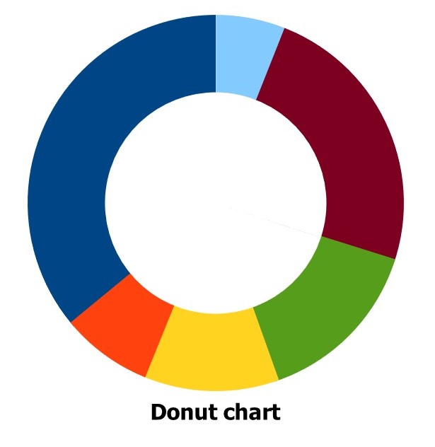
Pie and Donut Charts
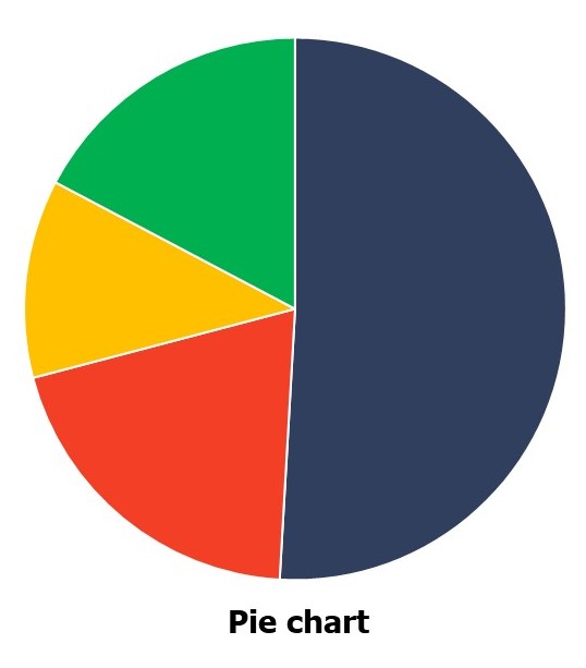 In general, it’s harder for our eyes to assess quantitative value by looking at angles (aka the wedges of the pie) or arcs (the pieces of the donut).
Credit: Cumeo89, Wikimedia Commons. Licensed under CC BY SA-3.0
If you must use a pie chart, start the first segment at noon and continue clockwise. Limit the sections to no more than five.
Also, create enough of a color contrast for each wedge.
3-D and Extra Effects
In general, 3-D should be avoided, along with other special effects that do not add to the data. For instance, some heatmaps are better served with animation, but random clip art or special effects that don’t convey the importance of the data are unnecessary.
Overloaded graphs
Dual axis graphs can become cluttered and confusing with multiple data sets and axes. They also might imply a relationship between two things that doesn’t exist. Nussbaum Knaflic and Evergreen suggest ways to improve this type of graph on their blogs here and here.
The Details Are in the Design
Designing visuals for complex subjects requires a deft balance of breadth and brevity. Or, as Andrew Abela notes in his book Advanced Presentations by Design:
“You need to find ways to respect the inherent complexity in your data, while explaining it with a persuasive and comprehensible simplicity.”
When you have complex data, your story is in the details. The tips and techniques in this report aim to highlight the details that matter and eliminate the details that distract.
Simply speaking, your data may be complex, but your display doesn’t have to be.
Additional Resources
There’s a big world of charts out there, and we encourage you to explore many other valuable resources on data visualization choices and techniques. We’ve included a list at the end of this report, including many which served as research for this post.
Books:
Advanced Presentations By Design: Creating Communication That Drives Action, by Andrew Abela
Better Presentations: A Guide for Scholars, Researchers, and Wonks, by Jonathan Schwabish
Presenting Data Effectively: Communicating Your Findings for Maximum Impact, by Stephanie D.H. Evergreen
Storytelling With Data: A Data Visualization Guide for Business Professionals, by Cole Nussbaumer Knaflic
Websites:
Blogs:
extremepresentation.typepad.com/
Share this article
- Share on Facebook
- Share on Twitter
- Share on LinkedIn
- Share on Email