Finding Your Perfect PowerPoint Image
From prehistoric cave drawings to modern-day emojis, images have long been employed by humans to convey ideas and information. This visual language is well-known to effective presenters, who see the perfect PowerPoint image as an enormously valuable tool.
A well-placed, compelling image sticks with an audience and can do more to enhance an audience’s understanding of a key point than words could ever do alone. You want your message to go deep.
What follows are four stages to your perfect PowerPoint image. As part of our public speaking training sessions , we go through each step to help you to identify the right images and the right way to use them in your next presentation.
The ‘Power’ in PowerPoint
A list of words on a screen imparts knowledge – sometimes – but well-curated graphics and visuals help our brains to retain those words. Our brains are primed to better remember when multiple senses are stimulated.
John Medina, a developmental molecular biologist and author of Brain Rules, explains the phenomenon in his Rule No. 9, “Stimulate more of the senses at the same time.”
He notes:
“The more elaborately we encode information at the moment of learning, the stronger the memory … Sensory processes are wired to work together.”
Further, a recent study discovered that people tend to forget what they hear quicker than what they see or touch. Other studies revealed that visuals offer the concrete cues that better help us to retrieve and remember information. Words are more abstract. As keys to unlock memories, words are easy to misplace.
As a result, PowerPoint slides cluttered with dozens of words that breed numerous bullets and sub-bullets will not have the impact one compelling visual, teamed with your key point, will. Words alone can’t do it. Here’s a good rule of thumb, even if we are taking 32 words to do it:
Ask yourself whether a visual representation of a key idea would do more to enhance your audience’s understanding of it. If it would, then use that slide. If it doesn’t, ditch it.
We’ll walk you through four slides, each of which is an improvement upon the previous one.
Image No. 1 – Text and Bullets
This is the most common type of text slide and not all that effective. It merely doubles as notes for the speaker. Who wants to look at the speaker’s notes during a presentation? Those words aren’t “sticky” and will probably be forgotten by the audience before you finish your talk.
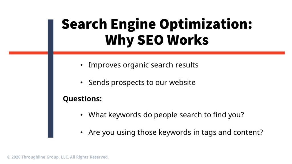
Image No. 2 – Text and Image
Some speakers think they can improve the slide by adding a related image (in this case, the Google search bar). But that image does little to help audience members remember the key points you want to make about SEO.
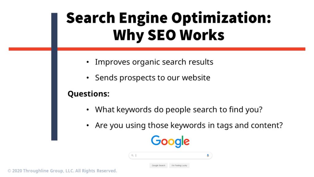
Image No. 3 – Too Literal (and Still Ineffective)
When we work with clients, they often focus on a key point, pull out a key word, and then center the visual around the word. That’s good that they are thinking more visually. But, it’s still often overly literal.
In this case, they might focus on the word “organic” and put up an image of vegetables. Or they might look at “keywords” and put up an image of a keychain. Or they might look at “prospects” and select an image of a person interviewing for a job. Or, as in the below slide, they might focus on the word “search” and make that the centerpiece of their visual.
This is a step in the right direction, but it still doesn’t quite do the trick. The slide simply isn’t memorable; nor does it evoke a specific idea.

Image No. 4 – Conceptual (and Just Right)
When you think conceptually, you increase your chances that your message will become deeply embedded into the minds of your audience.
To get people to stop thinking literally, we tell them to forget about the slides altogether. The trick to finding a slide that can serve as an enduring conceptual metaphor is to put away your notes and ask this question: What do you want people to know about each of your key ideas?
This is the type of answer we typically hear:
“Well, I want people to know that SEO is a really important tool to help entrepreneurs find customers online. I’ve seen so many good businesses go belly up because they didn’t know how to target their customers. But if you have good SEO and people can find you easily, you’ll have customers streaming into your business through your website.”
Now we’re getting somewhere. By listening carefully, we’ve identified a few potential concepts. We could play with the idea of customers “streaming in” through a door. Or banging down your door. Or, as you’ll see in the example below, we focused on the more cautionary tale of what happens to a business that fails to prioritize SEO.

In a nutshell, here’s our process for pairing the right idea with the right visual:
- Brainstorm by talking out loud about the points you want to make on a specific slide. Don’t overthink it. Rather, let the words and phrases flow.
- Pay careful attention to any words or phrases that might evoke an idea, which could become the slide’s central image. Adjectives and descriptive phrases often work well. This is a far easier step if someone else is listening. As you speak, they listen and capture interesting and compelling words and phrases.
- Take the list and start thinking of images that could provide a conceptual metaphor.
As you can see, a well-placed, compelling image can do more to enhance an audience’s understanding of a key point than words could ever do alone.
Share this article
- Share on Facebook
- Share on Twitter
- Share on LinkedIn
- Share on Email