Bill Cosby: A Powerful Cover And A Number That Matters
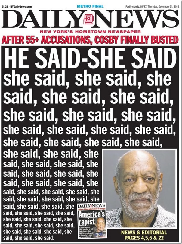
When Bill Cosby was arrested in late December for the alleged sexual assault of one of his many accusers, the New York Daily News ran a memorable cover.

That cover immediately struck me as powerful—and has lingered in my mind ever since.
To discuss why that cover struck me as such a good example of the power of well-designed visuals, please read the passage below from my book The Media Training Bible (Support the blog! Buy now!):
Four and a half million Americans have Alzheimer’s disease.
Did that number make you think, “Wow!” Did it evoke a specific image of what 4.5 million people looks like? I’m guessing not.
The problem is that most of us can’t remember raw numbers or place them into a larger perspective…Your job is to take boring, impersonal numbers and provide them with meaningful context that elicits a powerful reaction.
For example, imagine you’re giving an interview to a Boston radio station. You might cite the Alzheimer’s statistic this way:
“Fenway Park seats 37,000 people. It would take 122 Fenway Parks to hold every American with Alzheimer’s disease. That’s four and a half million people in total who are afflicted with this awful disease.”
For most people that statistic, loaded with context, is more powerful. It paints a memorable mental picture and produces a “wow” response.
With that as the backdrop, go back and read the top portion of the Daily News headline:
“After 55+ Accusations, Cosby Finally Busted”
Anyone reading that headline alone could grasp just how vast the scale of Mr. Cosby’s alleged crimes is. But for me, seeing 55 instances of the phrase “she said” (56, actually, allowing for additional accusers) brought the breadth of the accusations against Cosby home much more powerfully. Seeing 56 instances of “she” helped me visualize 56 individual victims, whereas the raw number of “55+” came across as less personalized and didn’t evoke the same feelings.
To see another example of this dynamic in action, look at this photo of “The Field of Empty Chairs,” located at the site of the 1995 Oklahoma City bombing that killed 168 people.

I find that visual representation of the 168 men, women, and children who were murdered by a domestic terrorist hard to look at—but it elicits a much more visceral and deserving response than a bland tribute would have, such as “168 Men, Women, and Children Killed at This Site In 1995.”
This 2012 article offers three additional tips to use statistics more effectively.
These two images also serve as good examples for why I bristle whenever I hear someone say “PowerPoint is evil” or that it should be banned altogether. Those sentiments—which tend to generate instant support from anyone who’s ever suffered through a bad presentation—are understandable but lazy. Great visuals, when thoughtfully conceived, can help your audiences experience similarly powerful reactions.
Don’t miss a thing! Click here to instantly join our mailing list and receive free media training and public speaking tips.


